How to test the accessibility of your components with Storybook
Developing accessible web sites isn't difficult if you use the right tools to test your components for accessibility, and Storybook is one of them.
Storybook
Storybook is an open source library that allows you to develop and document your components in an isolated environment, without having to take into account the possible dependencies that you would have if you developed those components directly in your application.
You can see the code in the project repository on my Github profile.
To go faster and streamline the process, I've used create-react-app, a tool to quickly generate a new single-page application. I've been trying to work only with Typescript for quite some time, so I preferred to use that configuration when creating the application.
$ npx create-react-app a11y-storybook --template typescript
After having created my application, which will serve as a component library, the next step is to add Storybook to the project. For this I will use the Storybook CLI to install it with a single command.
$ npx sb init
This command will install all the necessary dependencies, add to my package.json file the necessary scripts to run storybook, create a default configuration for storybook in the hidden ./.storybook folder, and add some test components as examples.
You can find those components in the ./src/stories folder. Once everything has been installed and configured, I can run Storybook.
$ npm run storybook
A new instance of your predefined browser will open and you will be able to view Storybook with the test components added during installation.
You can read more about this whole process in the official Storybook documentation
Creating the components
The test components are fine as examples, but I want to create my own components to test them, so what I have done is delete all that test content and I have created several components with accessibility errors to check if Storybook can find the accessibility vulnerabilities that I have included in them. I have created the following components and their respective stories:
ColorContrast.tsxA component with color contrast errors.CustomRole.tsxA component with a role that does not exist.HeadingOrder.tsxA component with heading element order errors.NoAltImage.tsxA component with an image without alternative text.NoTextButton.tsxA component with a button with no text inside.TabIndex.tsxA component with a tabindex greater than zero.
Let's see how we can test the accessibility of the components with Storybook.
Accessibility addon
The first thing I have to do is add the addon-a11y to my project.
$ npm install @storybook/addon-a11y --save-dev
After that I add it to the addons list in the file ./.storybook/main.js
module.exports = {
  stories: ["../src/**/*.stories.mdx", "../src/**/*.stories.@(js|jsx|ts|tsx)"],
  addons: [
    "@storybook/addon-links",
    "@storybook/addon-essentials",
    "@storybook/preset-create-react-app",
    "@storybook/addon-a11y",
  ],
}
With these two steps we will have added the addon-a11y in our project and we will be able to see the results when we run Storybook.
$ npm run storybook
Testing accessibility in Storybook
The Storybook accessibility addon uses the Axe accessibility engine developed by Deque Systems.
When executing Storybook you will see that next to the Controls and Actions panel, the Accessibility panel will now appear. If you access this panel, you will see the results of the tests organized in three tabs. In the first tab, violations, a list of accessibility vulnerabilities found in the component will be displayed. Each element of that list can be expanded and show more information about the vulnerability, degree of severity, ... etc, as well as a link to the documentation compiled by Deque in its Dequeuniversity so you can read more about the vulnerability, the violated rule, and how to fix it.
In the second tab, passes, you will see a list of the rules that Axe considers to have passed the tests successfully, and in the third tab, incomplete, you will see a list of what Axe defines as incomplete rules. That is to say, they have not passed the tests successfully, but they cannot say if they have really failed. In this case, Axe provides more information for you, as a developer, to decide how to react to those rules.

To the right of the panel you can activate a checkbox, highlight results, so Storybook highlights on the screen the elements that are violating the accessibility rules. Three different colors will be used for each of the panels: green for tests passed successfully, red for vulnerabilities, and yellow for incomplete ones.

Emulating vision deficiency in Storybook
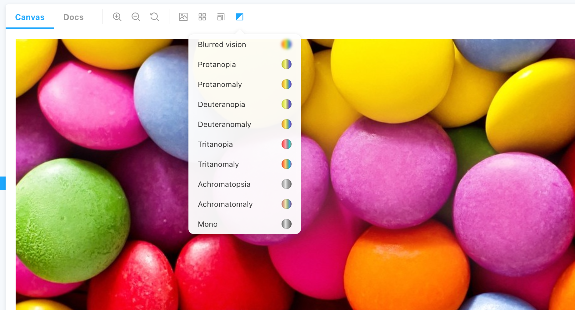
The Storybook accessibility addon can not only be used to show the tests run by the Axe accessibility engine, but also includes a vision deficiency emulator. The options are: Blurred Vision, Protanopia, Protanomaly, Deuteranopia, Deuteranomaly, Tritanopia, Tritanomaly, Achromatopsia, Achromatomaly, and Mono.

I have added an additional component, ColorImage.tsx, which displays an image with multiple colors to test this emulator.
By emulating different vision deficiencies, you will be able to better understand when to use different colors and understand that it is not advisable to rely solely on colors, for example in error states in forms.

Conclusion
As you have seen, Storybook is not only a tool to document your components in an isolated environment, it also allows you to test the accessibility of your components before using them in your application.
The project and the components used in this article have been developed in React, but Storybook has support for many more frameworks like Vue, Angular, Web Components, React Native ... etc. You can reado more at the official Storybook website. You can see the code in the project repository on my Github profile.
If you want to continue learning about web accessibility, you can follow me on my twitter account, and do not hesitate to contact me or tweet me if you have any questions or doubt.